Sunday, March 25, 2012

Your personal tour of our 2012 DreamHome-Design Craft room!

The overall: Stark Carpets fabricated this rug for me from my custom design.  It turned out stunning!
The last couple of weeks have been especially busy for our office.  We have been installing client projects and our 2012 DreamHome room which opened on the 15th.

Each of the designer's rooms were to be inspired by a piece in the Smithsonian Renwick Galleries upcoming show- 40 under 40.  My room was inspired by Christy Oates' Crane Chair (see our earlier post on the show and Christy).  I decided to create a woman's power office.  My muse was Vera Wang.  Like one of her famous dresses, I wanted to create layers of detail that would be full of quality and sophistication.  I loved working with the other designers (Jeff Akseizer, Christine Philp, Kori Keyser, Scott Cooke, Catherine Hailey, Will McGovern and Miriam Dillon) and found it interesting how they each interpreted their art pieces into room designs.


If you click on the link you can see more of the room details and watch a little video that shows some of the elements in detail.  There is nothing like seeing the room in person though- the layers of texture can not come through in photography.  The beauty of this Design House is that it is FREE!  So all of you out there should grab a friend and head down to the DC Design Center's 5th floor to see it.


Enjoy some of these detailed photos!!!  Did you know that our room has connections to the Dalai Lama?  See below... =)
I designed custom bookcases- Phoenix Handcraft made them gorgeous!  Hines sells this criss-crossed metal based coffee table.  Henredon did the sofa and Michael Cleary provided the awesome stacked acrylic lamps.
The end-table is another custom piece.  Phoenix Handcraft  did the metal and mosaic work.  Notice the great multi-color pillow fabric?  It actually was the first fabric we found for the room.  Stoddard Interiors fabricated the pillows and draperies for me.  The drapery has a beautiful pleat that she does incredibly well.  They look beautiful!
Leather wrapped wall panels, Angel Homsi Leather, in a diagonal pattern- you don't need anything hanging over a fireplace this pretty.

Notice the "puddle" effect at the bottom and the folded detail at the corner of the fireplace frame.  The sparkly bits in the fireplace is recycled glass.
Willem Smith provided the desk chairs.  The Dalai Lama sat in the cream colored one when he visited DC last year!
European Design, Inc in Manassas did the embroidery of our custom criss-cross pattern and did a wonderful job.  It really evokes the inspiration piece.
A Baker table and a Niermann Weeks console set up a pretty niche.  One thing that the contractor I used, PA Portner did for me is paint the trim.  Notice the high gloss shine?  You can finally get water based paint in a true gloss finish!  Yay!
Judy Koessel from Koessel Studios provided the wall coverings for the room.  She is amazing!  We chose a simple grass-cloth styled design for the main walls and this cross-hatched pattern for the accent niche.  Amanda loved gluing these little glass gems onto it =).  I wish you could see the texture of this in person!  Marly's Superior Interiors did a beautiful job installing the wall treatment for me.

Wednesday, March 21, 2012

DC Design House preview

Hello readers!  Apologies for the long break.  Let's just say that I've been burning the midnight oil recently.  So while this really should be a posting about our newly installed DreamHome room I have to say that I have failed to take any real photos of the space to share with you all.  I will be visiting Friday and I promise to return with detailed photos to show off our new installation!  Please check back in a few days, I promise you will not be disappointed!
Our next task: the DC Design House project will install in a short couple weeks.  I can share a little preview of our bowling alley shaped deck.  We will be featuring some custom built benches and pedestals, a wall of acrylic art panels, billowy sheers and funky prints.  This swing chair is sitting at my office and is stunning in person, can't wait to install it!


Tuesday, February 14, 2012

You've probably never seen anything like this!!

Charma and Margaret

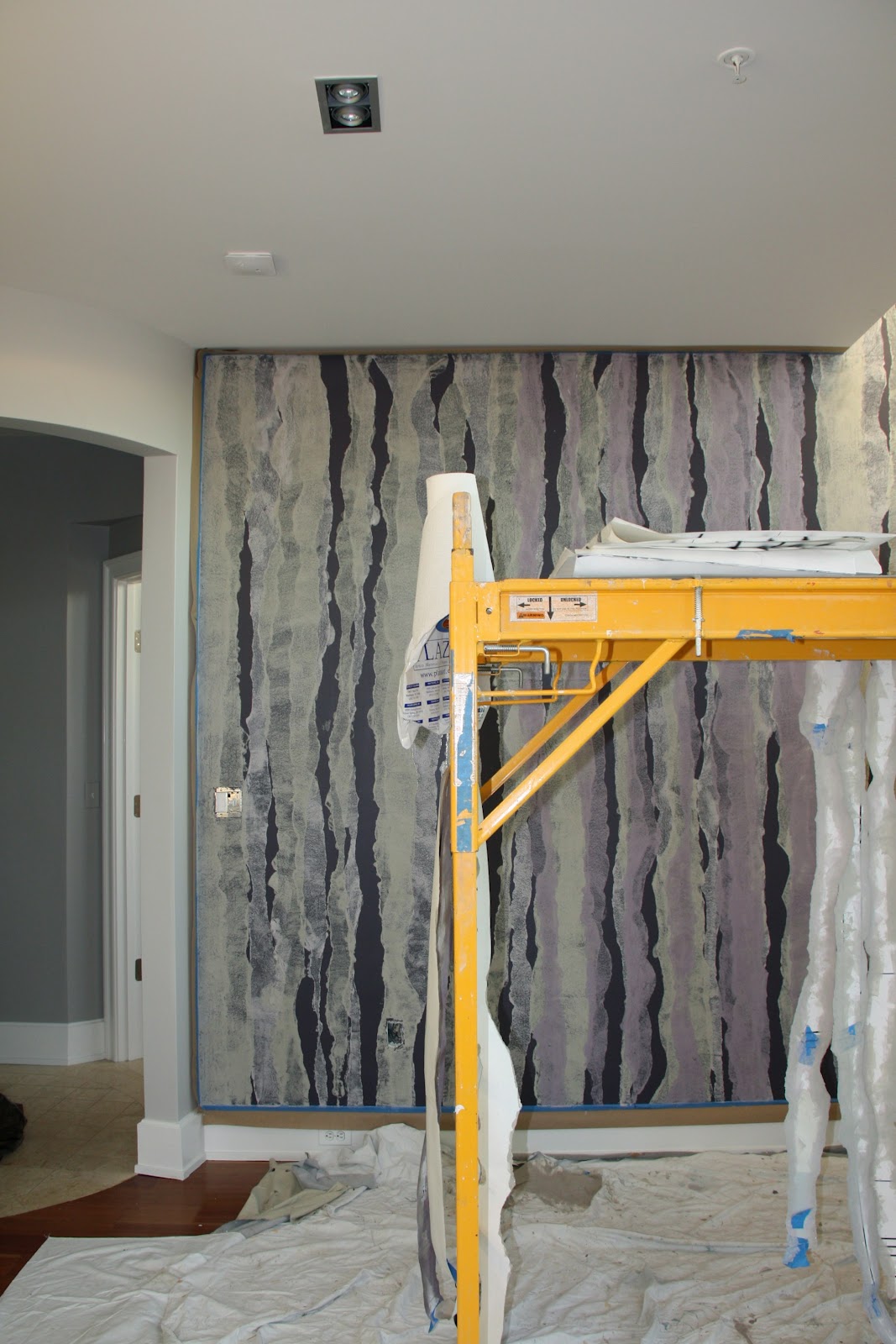
In my 13 years as a designer I have been lucky to work with a host of talented people.  One of my favorite people and one of the most amazingly talented artists I know is Charma Le Edmonds of Shelter Studios.  She just completed an AMAZING feature wall in a clients house.  This wall is so unbelievable, not only because of the scale and complexity of the pattern but because of the amazingly power it exudes in strangely subtle manor.  
The following photos are a progression over 11 days.  You have to see the process that she used to create this piece of art!


Tuesday, February 7, 2012

Thinking warm, despite the cold!

Even though it is only February it is the perfect time of year to let your mind wander to the outdoors.  Because my focus is interiors I don't get to work on exterior spaces as frequently as I might like, so when I do get those periodic opportunities I am always shocked by the new products that are on the market.
photo from sunbrella.com
Can you believe that the photo above is of exterior fabrics?  Who thought you could have a gorgeous damask pillow with decorative trim living on your deck chair.  
photo from lloydflanders.com
The above lounge furniture could easily be in sexy living room setting.  But we are lucky enough to be using it on the deck that we have been asked to design for the DCDesign House.  You got it, another show house- this is going to be a busy, busy spring!  We'll share more details and drawings as we get farther into the design.

Sunday, January 22, 2012

In the works....

We were picked to be part of the DC Design Center's DreamHome this year!  We are honored to be chosen.  The show is going to be in conjunction with the Smithsonian Renwick Gallery's 40 under 40 exhibit that will be done this summer to celebrate the Renwick's 40th anniversary.  So in that same vein 8 young designers in the DC area were chosen to create room designs based on artwork in the exhibit.
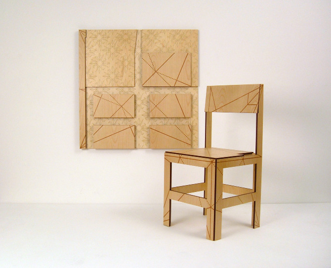
My artist is Christy Oates and creates fantastic functional pieces of art/furniture.  Take a peek:
Crane Chair wall panel
Crane Chair set out

So in addition to our normal client load we have been managing the details of getting our room completed.
Here is your sneak peek of the design.  More details will follow in the next month!

Wednesday, January 4, 2012

Are you an art offender?! Fix it- here's how!

Over Christmas break I spent a little bit of time helping my mother-in-law hang artwork.  She had been wanting to put the pieces up for a long time but wanted to make sure that it was done properly. Since nearly every one of my clients has shared the same affliction of hanging their artwork too high I realized that hanging or rehanging artwork is a fantastic way to make your home look better without spending much money.
Here are some tips that I have learned over the years by watching and learning from some of the best professional art hangers in the business:
1.  First make sure that your art is wired properly.  It should be wired across the back toward the top of the piece.  Most other hangers (combs or center D rings) will not keep your artwork straight.
2.  Use the proper hanging hardware.  Do not use nails or J hooks.  The ones that you should buy have "nails" that look like stud earrings.  They come in different weight options and it is better to err on the heavier side.
3.  On a standard 8' wall almost any piece of art is best hung at 5' (60") on center.  First measure the overall height of the artwork and divide by two to find the center.  Then subtract the distance of the wire from the top from that distance.  If you add this number to 60" you will locate the height that your hangers should be placed on your wall.
4.  Hang two hooks for pieces 12" or wider.  The hooks should be placed about 1/2 of the width of the piece apart.  So for an 18" piece your hooks should be 9" apart.
5.  Level your artwork and stand back and admire your handiwork!

Avoid hanging art too high (these are also too far apart)!

photo from www.freshome.com

Small pieces hung in a more successful arrangement.

Monday, December 19, 2011

Sweet Treats- easy on the eyes and the palette!


My associate designer Amanda is an awesome baker.  Her specialty seems to be brownies, but I have yet to have a subpar treat from her.
This morning she brought in sweet tins of the most delicious mint chocolate brownies. This got me to thinking about homemade gifts and how much they show you care. Especially as time gets more and more precious I realize the true meaning of these handmade offerings is much more than meets the eye. 
I came across a blog by a graphic designer who showed her creative side in her baked offerings. Take a look at the colorful creations that Kimcreativestar.com made for holiday gifts.  
photo from Kimcreativestar.com

And of course if you have any questions on how to pack and ship your treat boxes, just talk to Martha. packing holiday cookies.
Be creative and have fun baking- no one will be disappointed!

photo from marthastewart.com

Sunday, December 11, 2011

Christmas Decorating- It's in the Details

Blog entry by Amanda WELCH

There are many things we can do to make our homes beautiful and welcoming to our guests during the Holidays.  From simple, beautiful touches to un-predeicatble placement of decorations, there are many changes we can make to create a festive atmosphere. 
One simple but beautiful decoration we love are these glass icicle ornaments.  They are hand made so each one is unique from the next.  They catch the light, and add an eye catching sparkle wherever they are used.  Of course we love to see ornaments on the Christmas tree, but you could get creative and find many other uses for them (see some examples below)
From oliveandcocoa.com
Another great way to make your home beautiful at the Holiday's is to place decorations in un-predicatable places.  Many people over-clutter their surfaces in their homes with Christmas decorations, creating a very busy look.  Think outside the box and spread your decorations around!  Decorate your hanging light fixtures, your banister, or hang decorations over the doorways.  Unusual placements create interest for your guests, and also create beautiful spaces without clutter. Those icicle ornaments we love: they would look great hanging in a chandelier or with some garland on a banister!  Any ornament that is particularly beautiful or special can be placed in a chandelier or on a banister, rather than getting lost in a Christmas tree.


Photos from Amanda's creative mother Judy

We hope you are all having a very happy Holiday season, and that these little tips will help you while you are making your home beautiful for the Holiday's!  Until next year....

Sunday, December 4, 2011

Tasty and Pretty- Use Holiday Food to Decorate!

A table setting by Ambi Design
One of the things that I like to do in my own home is decorate with edibles.  During this time of the year where life is so centered around family and entertaining it just makes sense to highlight and feature the food that is so integral to the celebration.  Plus, the dual purpose nature of your displays make them a great way to stretch your household budget.
Some of the ideas I have used:
-Clear glass apothecary or spice jars of red and white peppermint disks help to spread the festive atmosphere to the kitchen.  You could use any other food that you enjoy that fits your holiday decor.
-Green and red pears and apples in various sizes look great on the family room coffee table in a wooden bowl and puts a healthy snack right at arms reach.
-Bowls of nuts or pretty ribbon candies are beautiful left out on end tables.  If they are going to be sitting for a long time look for a bowl with a glass lid.
-Instead of a formal centerpiece I have used tiered display stands to showcase pretty baked goods on the dining table.  It doesn't have to be a formal cake- decorative cookies or breads look great too.  If the baked goods lack color you can add an edible flower to the mix.
Have fun and be creative!  That fruitcake from your great aunt might make the perfect edible (if just a tad dry =) holiday centerpiece!

Added 12/5
Look at this Buddha Hand fruit that I saw at a client's house today-
so cool, and a perfect example of decorating with food!


Saturday, November 26, 2011

Just say no to fake (or at least do it right)! Version 2: Christmas

We travel over the holidays and we have a cat that likes to eat greenery, so combined this means... fake tree.  Yes, some of you may be gasping right now, but it's true!  And honestly, I don't really mind.  I've learned some tricks to help make a sparse fake tree look lush- here are my secrets.
The fake tree.  Notice the holes.  Not cute!
1.  We hang three strands of lights, winding them in and out of the branches.
2.  I fill the holes with holly.  Here is my stash.  
3.  I then hang silver mirrored ball ornaments as far toward the trunk of the tree as I can.  The mirrored balls help to reflect the lights and create an illusion of depth.  Before I am ready to even decorate I have put 62 ornaments on the tree.
4.  Here is how it looks at this point (with the beautiful glass icicles I just bought- look for a future posting on my fav holiday decor).  Now that I have fixed the "architecture" of the tree I am finally ready to hang the decorative ornaments.
5.  I personally keep the color palette simple white, red and silver.  Finished!

Wednesday, November 16, 2011

Keeping it simple!

Simple furniture does not necessarily cary a simple price.  Yes, there are manufacturers who create fun, inexpensive, modern furniture (Ikea, West Elm and CB2 immediately come to mind).  However, a truly hand crafted piece of furniture with simple lines will typically carry a decent price tag.  What is the reasoning behind this irony?
I was at a new client's house this morning and she was telling me about a pretty, contemporary console table that she had made by a metalsmith.  Apparently the metal worker declared after finishing the piece that he would never make another piece of furniture for her.  He told her that he had spent much more time working on her piece then he spent on his usual ornate designs because each joint, weld and polish mark had to be perfect since there was no ornamentation to hide little flaws.  This holds true for most types of furniture.  Simple pieces are the perfect foil to display an artisans talents, where the cleaner the work, the cleaner the piece.
Take for example this simple but stunning desk from Thomas Moser that I have coveted for years.  You can't really appreciate the amazing joinery from the photo, but you can see some of the simple structural details that help make it great.

Wednesday, November 9, 2011

Lovin' the sun!

I don't know if winter's fast approach has anything to do with my current obsession with the sun. Call it vitamin D deficiency or what you will, but you can't deny that this motif is mesmerizing!
Photo from koesselstudios.com
I just got the new Koessel Studios wallpaper book. This is a new pattern called Del Sol that has relief printed rays and a beautiful iridescent glass bead in the middle.
Photo from 1stdibs.com
This motif has appeared throughout history.  It's definitely a classic, but still seems modern. Check out this 1940's French mirror from Carl Moore Antiques on 1st Dibs.


And here is one of my projects in McLean, VA.  The sun seems right at home in this dining room. With all this talk of the sun I think I am feeling just a little bit warmer!

Wednesday, November 2, 2011

Did you see us in the Post?!

Thank you to the Washington Post for asking us to be a part of the on-going design series!  We were asked to design a fun, family friendly, pre-teen hangout.  Here is a link to the article: Post House Calls

photo from www.washingtonpost.com

You may remember seeing our inspiration board a few blogs back.  We utilized our usual technique of mixing high and low pieces to create a well rounded, balanced space.  Fun, don't you think?!

Wednesday, October 26, 2011

Maximize your house!

Have you ever walked into a room and known immediately that the furniture should be arranged a certain way?  Well stop, this a sure-fire way to cost yourself valuable square footage!
This is how a living room looked before my client purchased it.  There are three identical units that are designed very similarly.
(Photo provided by Washington Fine Properties)

This layout has its positives.  Because the sofa faces the fireplace it does a good job of highlighting the focal point within the seating group.  Both options create a very small, intimate conversation area.  However, if you want your space to look as large as possible here are some things to avoid:

-Do not select an undersized area rug.  This is the biggest mistake that many homeowners and designers make. 
-Don’t squeeze your arrangement toward the fireplace or focal point.
-Avoid creating a walk space behind your conversation area.  This makes the room visually end at the back of the furniture grouping.
-In certain situations angling your furniture closes off the space and visually limits square footage.
-Do not select furniture that is under scaled or over scaled.  Pay attention to the seat and back height of your choices.

Here is an alternate plan that was created for my client and a photo of the in-progress design.

Here are some ideas that we used that may translate to your space:

-One large room sized area rug (NOT installed yet) in the living room defines its function and makes the entire room fair game for seating.  As an alternate you could consider a wall-to-wall or custom fit installation.
-By selecting a sofa with a commanding length we visually balanced the fireplace. 
-Pushing the sofa all the way back to the wall virtually widens the room.  
-Creating two adjacent seating groups is conducive to entertaining because it allows for large groups while still allowing intimate conversations.   
-We designed armless chairs and loveseats in order to promote cross group interactions. 
-Appropriately scaled furniture fills the space without making it feel crowded.

You may not be able to add square footage to your home, but you can certainly maximize it with your furniture arrangement- so explore all of your options.


Thursday, October 20, 2011

Amanda meets Philip Gorrivan!


(photo from philipgorrivan.blogspot.com)
For those of you who don’t know me, I’m Amanda, an associate designer at Ambi Design Studio.  I met Shanon while I was working in the Duralee/ Highland Court showroom at the Washington Design Center.

While I worked at Duralee/ Highland Court, I was introduced to a line of fabrics designed by Philip Gorrivan.  I began to follow his design work, and I loved when his new fabric lines were presented through Highland court.   His fabrics are BEAUTIFUL, and he is a talented designer.  We love how his collections are so unified and can be used together in a space without looking “too designer”.   He has created beautifully bold and colorful fabrics, as well as simply subtle patterns and prints.  


This week he gave a lecture at the Washington Design Center in the Duralee/Highland Court showroom.  We had the privilege to listen to his lecture on his designs, fabrics, and inspirations.  I was amazed at where he drew his inspirations from; anywhere from architectural details to world travel to doorknobs!  He is an inspirational designer, and I was thrilled to get to meet him!


Tuesday, October 11, 2011

Think of paint as desert, not a starter!

If I told you that paints are the finishing touch on a room design would you be surprised?  You are not alone, most of my clients are bewildered when I inform them of this.  So what is the typical "secret" process used to create a beautiful room and a cohesive color palette?  You can check out my guest blog post for Home and Design Magazine to find out!  Here is the link: Home and Design Guest Blog
Paint is the least expensive change you can make to your room.  So have your desert, just don't skip the rest of your meal!

Wednesday, October 5, 2011

The colors of $!

Do colors make people happy?  Or do happy people choose to be around color?  This is the chicken or egg question I have been thinking about the last couple of days.

I remember reading a design article (I think in the ASID Icon) a couple of years ago about color trends for interiors.  It discussed how color trends throughout the decades have usually reflected what is going on politically and economically.  Let's explore:

In the 60's and 70's the back-to-earth movement produced the earthy palette of avocado green, harvest gold and pumpkin that later left many homeowners wishing for appliance upgrades.  Although this particular homeowner seems pretty darn pleased....
(photo by GE appliances)

The manic 80's produced crazy neon bright colors and the never-to-be-forgotten salmon pink and teal combo.  The economy was starting to boom and the population in whole was definitely acting like someone with new money.

One of my favorite cartoons EVER!! 
(photo from g4tv.com)
Oh and let's not forget the waterbeds!
(from uglyhousephotos.com)

The 90's were all about beige (very stoic and proper like a family with old money).  Color, what's that?
(from leonfjord.com) 
And now, after it seems we have avoided an economic meltdown on the scale of the great depression by the skin of our teeth, am I seeing another color revolution?  I just bought a pair of pants for my daughter that appeared to be pink on-line.  When they came they were NEON hot pink.  I haven't seen a color like since I gave up my favorite, worn to shreds, t-shirt that I owned in the Jem era (see above)!  Not to mention the severe color beer goggles that I am suffering from after being saturated in the Missoni for Target collection (see my previous blog post Oh Missoni- you make me feel like a kid on Christmas morning!)!  Suddenly, beige just seems boring and color seems amazing.  What does this mean?  Am I unique in this feeling?  Or are we on the verge of another "Material Girl"era?  Who knows, all I can say is that I am enjoying it for now.
Our design for a pre-teen girl's hangout that we designed for the Washington post-
 see the rendering of the room in the paper in a couple of weeks!