Monday, December 19, 2011

Sweet Treats- easy on the eyes and the palette!


My associate designer Amanda is an awesome baker.  Her specialty seems to be brownies, but I have yet to have a subpar treat from her.
This morning she brought in sweet tins of the most delicious mint chocolate brownies. This got me to thinking about homemade gifts and how much they show you care. Especially as time gets more and more precious I realize the true meaning of these handmade offerings is much more than meets the eye. 
I came across a blog by a graphic designer who showed her creative side in her baked offerings. Take a look at the colorful creations that Kimcreativestar.com made for holiday gifts.  
photo from Kimcreativestar.com

And of course if you have any questions on how to pack and ship your treat boxes, just talk to Martha. packing holiday cookies.
Be creative and have fun baking- no one will be disappointed!

photo from marthastewart.com

Sunday, December 11, 2011

Christmas Decorating- It's in the Details

Blog entry by Amanda WELCH

There are many things we can do to make our homes beautiful and welcoming to our guests during the Holidays.  From simple, beautiful touches to un-predeicatble placement of decorations, there are many changes we can make to create a festive atmosphere. 
One simple but beautiful decoration we love are these glass icicle ornaments.  They are hand made so each one is unique from the next.  They catch the light, and add an eye catching sparkle wherever they are used.  Of course we love to see ornaments on the Christmas tree, but you could get creative and find many other uses for them (see some examples below)
From oliveandcocoa.com
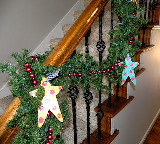
Another great way to make your home beautiful at the Holiday's is to place decorations in un-predicatable places.  Many people over-clutter their surfaces in their homes with Christmas decorations, creating a very busy look.  Think outside the box and spread your decorations around!  Decorate your hanging light fixtures, your banister, or hang decorations over the doorways.  Unusual placements create interest for your guests, and also create beautiful spaces without clutter. Those icicle ornaments we love: they would look great hanging in a chandelier or with some garland on a banister!  Any ornament that is particularly beautiful or special can be placed in a chandelier or on a banister, rather than getting lost in a Christmas tree.


Photos from Amanda's creative mother Judy

We hope you are all having a very happy Holiday season, and that these little tips will help you while you are making your home beautiful for the Holiday's!  Until next year....

Sunday, December 4, 2011

Tasty and Pretty- Use Holiday Food to Decorate!

A table setting by Ambi Design
One of the things that I like to do in my own home is decorate with edibles.  During this time of the year where life is so centered around family and entertaining it just makes sense to highlight and feature the food that is so integral to the celebration.  Plus, the dual purpose nature of your displays make them a great way to stretch your household budget.
Some of the ideas I have used:
-Clear glass apothecary or spice jars of red and white peppermint disks help to spread the festive atmosphere to the kitchen.  You could use any other food that you enjoy that fits your holiday decor.
-Green and red pears and apples in various sizes look great on the family room coffee table in a wooden bowl and puts a healthy snack right at arms reach.
-Bowls of nuts or pretty ribbon candies are beautiful left out on end tables.  If they are going to be sitting for a long time look for a bowl with a glass lid.
-Instead of a formal centerpiece I have used tiered display stands to showcase pretty baked goods on the dining table.  It doesn't have to be a formal cake- decorative cookies or breads look great too.  If the baked goods lack color you can add an edible flower to the mix.
Have fun and be creative!  That fruitcake from your great aunt might make the perfect edible (if just a tad dry =) holiday centerpiece!

Added 12/5
Look at this Buddha Hand fruit that I saw at a client's house today-
so cool, and a perfect example of decorating with food!


Saturday, November 26, 2011

Just say no to fake (or at least do it right)! Version 2: Christmas

We travel over the holidays and we have a cat that likes to eat greenery, so combined this means... fake tree.  Yes, some of you may be gasping right now, but it's true!  And honestly, I don't really mind.  I've learned some tricks to help make a sparse fake tree look lush- here are my secrets.
The fake tree.  Notice the holes.  Not cute!
1.  We hang three strands of lights, winding them in and out of the branches.
2.  I fill the holes with holly.  Here is my stash.  
3.  I then hang silver mirrored ball ornaments as far toward the trunk of the tree as I can.  The mirrored balls help to reflect the lights and create an illusion of depth.  Before I am ready to even decorate I have put 62 ornaments on the tree.
4.  Here is how it looks at this point (with the beautiful glass icicles I just bought- look for a future posting on my fav holiday decor).  Now that I have fixed the "architecture" of the tree I am finally ready to hang the decorative ornaments.
5.  I personally keep the color palette simple white, red and silver.  Finished!

Wednesday, November 16, 2011

Keeping it simple!

Simple furniture does not necessarily cary a simple price.  Yes, there are manufacturers who create fun, inexpensive, modern furniture (Ikea, West Elm and CB2 immediately come to mind).  However, a truly hand crafted piece of furniture with simple lines will typically carry a decent price tag.  What is the reasoning behind this irony?
I was at a new client's house this morning and she was telling me about a pretty, contemporary console table that she had made by a metalsmith.  Apparently the metal worker declared after finishing the piece that he would never make another piece of furniture for her.  He told her that he had spent much more time working on her piece then he spent on his usual ornate designs because each joint, weld and polish mark had to be perfect since there was no ornamentation to hide little flaws.  This holds true for most types of furniture.  Simple pieces are the perfect foil to display an artisans talents, where the cleaner the work, the cleaner the piece.
Take for example this simple but stunning desk from Thomas Moser that I have coveted for years.  You can't really appreciate the amazing joinery from the photo, but you can see some of the simple structural details that help make it great.

Wednesday, November 9, 2011

Lovin' the sun!

I don't know if winter's fast approach has anything to do with my current obsession with the sun. Call it vitamin D deficiency or what you will, but you can't deny that this motif is mesmerizing!
Photo from koesselstudios.com
I just got the new Koessel Studios wallpaper book. This is a new pattern called Del Sol that has relief printed rays and a beautiful iridescent glass bead in the middle.
Photo from 1stdibs.com
This motif has appeared throughout history.  It's definitely a classic, but still seems modern. Check out this 1940's French mirror from Carl Moore Antiques on 1st Dibs.


And here is one of my projects in McLean, VA.  The sun seems right at home in this dining room. With all this talk of the sun I think I am feeling just a little bit warmer!

Wednesday, November 2, 2011

Did you see us in the Post?!

Thank you to the Washington Post for asking us to be a part of the on-going design series!  We were asked to design a fun, family friendly, pre-teen hangout.  Here is a link to the article: Post House Calls

photo from www.washingtonpost.com

You may remember seeing our inspiration board a few blogs back.  We utilized our usual technique of mixing high and low pieces to create a well rounded, balanced space.  Fun, don't you think?!

Wednesday, October 26, 2011

Maximize your house!

Have you ever walked into a room and known immediately that the furniture should be arranged a certain way?  Well stop, this a sure-fire way to cost yourself valuable square footage!
This is how a living room looked before my client purchased it.  There are three identical units that are designed very similarly.
(Photo provided by Washington Fine Properties)

This layout has its positives.  Because the sofa faces the fireplace it does a good job of highlighting the focal point within the seating group.  Both options create a very small, intimate conversation area.  However, if you want your space to look as large as possible here are some things to avoid:

-Do not select an undersized area rug.  This is the biggest mistake that many homeowners and designers make. 
-Don’t squeeze your arrangement toward the fireplace or focal point.
-Avoid creating a walk space behind your conversation area.  This makes the room visually end at the back of the furniture grouping.
-In certain situations angling your furniture closes off the space and visually limits square footage.
-Do not select furniture that is under scaled or over scaled.  Pay attention to the seat and back height of your choices.

Here is an alternate plan that was created for my client and a photo of the in-progress design.

Here are some ideas that we used that may translate to your space:

-One large room sized area rug (NOT installed yet) in the living room defines its function and makes the entire room fair game for seating.  As an alternate you could consider a wall-to-wall or custom fit installation.
-By selecting a sofa with a commanding length we visually balanced the fireplace. 
-Pushing the sofa all the way back to the wall virtually widens the room.  
-Creating two adjacent seating groups is conducive to entertaining because it allows for large groups while still allowing intimate conversations.   
-We designed armless chairs and loveseats in order to promote cross group interactions. 
-Appropriately scaled furniture fills the space without making it feel crowded.

You may not be able to add square footage to your home, but you can certainly maximize it with your furniture arrangement- so explore all of your options.


Thursday, October 20, 2011

Amanda meets Philip Gorrivan!


(photo from philipgorrivan.blogspot.com)
For those of you who don’t know me, I’m Amanda, an associate designer at Ambi Design Studio.  I met Shanon while I was working in the Duralee/ Highland Court showroom at the Washington Design Center.

While I worked at Duralee/ Highland Court, I was introduced to a line of fabrics designed by Philip Gorrivan.  I began to follow his design work, and I loved when his new fabric lines were presented through Highland court.   His fabrics are BEAUTIFUL, and he is a talented designer.  We love how his collections are so unified and can be used together in a space without looking “too designer”.   He has created beautifully bold and colorful fabrics, as well as simply subtle patterns and prints.  


This week he gave a lecture at the Washington Design Center in the Duralee/Highland Court showroom.  We had the privilege to listen to his lecture on his designs, fabrics, and inspirations.  I was amazed at where he drew his inspirations from; anywhere from architectural details to world travel to doorknobs!  He is an inspirational designer, and I was thrilled to get to meet him!


Tuesday, October 11, 2011

Think of paint as desert, not a starter!

If I told you that paints are the finishing touch on a room design would you be surprised?  You are not alone, most of my clients are bewildered when I inform them of this.  So what is the typical "secret" process used to create a beautiful room and a cohesive color palette?  You can check out my guest blog post for Home and Design Magazine to find out!  Here is the link: Home and Design Guest Blog
Paint is the least expensive change you can make to your room.  So have your desert, just don't skip the rest of your meal!

Wednesday, October 5, 2011

The colors of $!

Do colors make people happy?  Or do happy people choose to be around color?  This is the chicken or egg question I have been thinking about the last couple of days.

I remember reading a design article (I think in the ASID Icon) a couple of years ago about color trends for interiors.  It discussed how color trends throughout the decades have usually reflected what is going on politically and economically.  Let's explore:

In the 60's and 70's the back-to-earth movement produced the earthy palette of avocado green, harvest gold and pumpkin that later left many homeowners wishing for appliance upgrades.  Although this particular homeowner seems pretty darn pleased....
(photo by GE appliances)

The manic 80's produced crazy neon bright colors and the never-to-be-forgotten salmon pink and teal combo.  The economy was starting to boom and the population in whole was definitely acting like someone with new money.

One of my favorite cartoons EVER!! 
(photo from g4tv.com)
Oh and let's not forget the waterbeds!
(from uglyhousephotos.com)

The 90's were all about beige (very stoic and proper like a family with old money).  Color, what's that?
(from leonfjord.com) 
And now, after it seems we have avoided an economic meltdown on the scale of the great depression by the skin of our teeth, am I seeing another color revolution?  I just bought a pair of pants for my daughter that appeared to be pink on-line.  When they came they were NEON hot pink.  I haven't seen a color like since I gave up my favorite, worn to shreds, t-shirt that I owned in the Jem era (see above)!  Not to mention the severe color beer goggles that I am suffering from after being saturated in the Missoni for Target collection (see my previous blog post Oh Missoni- you make me feel like a kid on Christmas morning!)!  Suddenly, beige just seems boring and color seems amazing.  What does this mean?  Am I unique in this feeling?  Or are we on the verge of another "Material Girl"era?  Who knows, all I can say is that I am enjoying it for now.
Our design for a pre-teen girl's hangout that we designed for the Washington post-
 see the rendering of the room in the paper in a couple of weeks!


Thursday, September 29, 2011

The contractor- friend or foe?

First off, this posting is not meant to offend contractors.  In my thirteen years as a designer I have met a number of contractors that I respect and who are genuinly trying to do their best.  This is my take on the relationship between designers and contractors on a jobsite.  

A designer's role within a project is to represent the client on the job site and to make sure that the project that is finished represents the project that was designed and approved up-front.  That means that we are hired to be the bad guy and to nitpick and to point out any variations from the design plan or slight inadequacies.  All of this is done in the hopes that the finished product will be taken to a higher aesthetic and quality level.  In my mind this relationship is MEANT to be tenuous at times with each party working toward their absolute best interests.  

So, is it really possible to find successful "teams" of contractors and designers?   Does this mean that a designer can't work repeatedly with the same company?  No, but in my opinion it does make it hard to find a company that you want to align with, because that means staking your professional reputation on the work of another organization.  If a designer does get into a "partnership" with another company the challenge would be to maintain objectivity.

This is why I choose foe.  Because looking from the eyes of a client- I want the creme de la creme and if you want to keep us happy then you need to bring your A game!

Wednesday, September 21, 2011

This chair needs help STAT!

I am a recycler.  You name it, I recycle it.  Ink tanks, tech equipment, batteries, pots and pans, and all the typical items like paper and plastic.  So it is only natural that I want to try to reuse as much of my client's furniture as I can during a project.

One of the most forgiving items to repurpose is upholstery.  I frequently come into contact with patients that seem to be on their last leg.  With the help of my upholsterer and armed with a good design plan I have snatched these lucky pieces from the big garbage heap in the sky!

PATIENT #1
BEFORE
Sixties era swivel rocker.  Good size but the years have not been nice to it.  Notice the unattractive low kick pleat skirt and awkwardly shaped back cushion.

AFTER
Let's admire the new floor to seat tailored kick pleat skirt.  A tight channel back replaces the loose back cushion.  The arm shape did not change but let's say this patient has made it through surgery with flying colors.

PATIENT #2
BEFORE
An early 80's gem.  The gathered ruching on the outside back is reminiscent of flash dance leggings.  The skirt is the same unattractive low kick pleat as in patient #1.  The client typically used arm caps so there was severe farmer's tan fading on the arms and the entire piece looked in need of a good bath.

AFTER
Here is our patient freshly upholstered in a up-to-date print that channels the same color vibe as the original.  Notice the new skirt and the smooth, clean back.  This former flash dancer is updated and ready for a night on the town!


Thursday, September 15, 2011

Oh Missoni- you make me feel like a kid on Christmas morning!


Anyone who knows me well knows how much I dislike mornings.  So it takes a real event to make me bolt out of bed at 5:30am without an alarm.  That event Tuesday was the unveiling of the Missoni for Target collection!!!

The collection was met with a crazy frenzy that I can only compare to a Black Friday event.  Within minutes products were sold out.  The website was so overloaded it crashed a number of times.  But I had success scoring a number of the home and clothing items that I have been eying for months!  My sister needed more instant gratification and waited in line to go into the store to see and buy in-person.  She came over Tuesday evening so we could divvy up some of the loot.  The quality is pretty amazing and this little taste of what is to come has only made me more excited to get my packages in a few days!

Even if you missed out on this event you can still have Missoni in your home at a reasonable cost.  Check out their beautiful display at the DCDC photographed above.  Stark carries this gorgeous collection of fabrics that is worth a splurge.  My budget trick to making a beautiful expensive fabric go a long way is to use it for the face only on several pillows.  Find an inexpensive coordinate for the back and cording.  You will get more impact this way than if you use the fabric on both sides of only one pillow.  Another great budget move is to have your tailor finish the raw edges of your fabric to turn it into an instant throw.

Think how beautiful these fabrics would be in your home!  I think I want that one and that one, oh and that one.....

Sunday, September 11, 2011

Perfectly Poirot!

I love the clean lines and elegant forms of the Art Deco period.  I also have a weakness for cheesy murder mysteries.  And who combines these two elements better than Agatha Christie? 1/2 of what I love about the Poirot series is the amazing set design.  Poirot's apartment is as perfectly appointed as his impeccably upturned moustache!


Monday, September 5, 2011

Just say no to fake (or at least do it right)!

Call me a snob, but I like products that are genuine, so in that vein I generally dislike imitations.  Sometimes however, I need to make exceptions.  In the case of window treatments there is nothing that can replace the effect of a well designed, well proportioned window treatment.  But you may not require the privacy of a full functioning drapery treatment, or a full functioning window treatment may not be in the project budget (Gasp, there is more to life to spend money on than kids and interiors?!).  If this describes you then you can still have beautiful panels that look natural.

Here's how:
1.  Splurge for custom or semi-custom treatments.  This is usually so necessary because houses, like people, rarely come in a "standard" size.  If you are wise with your fabric choice then you can usually keep your costs similar to upper end ready made panels.  Have your drapery work room make them long enough so that they can be hung a few inches lower than the ceiling height or a few inches lower than the crown molding.  For higher ceilings you can get away with hanging them a little bit further from the ceiling.  Use one width of fabric on each side of the window, this means that you will likely need 6-8 yards of fabric for one window in a room with a 8'-10' ceiling height.
2.  Order your drapery rod 3-6 inches wider than the full width of the window, including the trim.  Avoid the urge to try to save a few bucks by ordering two short rods.  For one thing, your cost savings is going to be little, if anything because you may need less rod, but you will need to order two extra sets of brackets.  Secondly- nothing screams "I'M FAKE" like seeing these little side rods.

Take a look at this in-process project.  We are doing it in stages and we just brought in the draperies.  Just see what a difference a little change makes!

Before

After

Monday, August 29, 2011

GO BIG _______ (your favorite college football team)!

Since we are on the verge of football season it occurs to me that there are probably many of you in the same situation that I find myself.  I have been a football widow for half of my life!  I can’t really blame my husband, he was clear about his obsession with the game from the very beginning.  And while I too appropriately cheer for my darling Husker’s while they play, I have no desire to take anything off of the field.  Unfortunately, my hubby doesn’t feel the same way.  If it were up to him he would be watching all the games in his Husker red man cave with every school spirited but slightly tacky piece of school licensed furniture out there.  So I thought that it would be beneficial to show how simple it could be to have a beautiful and patriotic schemed room.  These rooms would do their teams proud!


RED AND WHITE
(room photo by Ambi Design Studio)


BLUE AND GOLD
(room photo from Ambi Design Studio)


RED AND YELLOW
(room photo from Ambi Design Studio)


BURGUNDY AND ORANGE
(room photo from Ambi Design Studio)


GREEN AND YELLOW
(room photo from southernliving.com)